
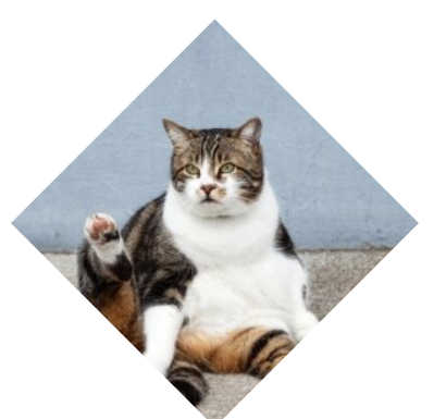
一起来学习如何用CSS实现菱形图形,先看效果:
直接上代码咯。
<!DOCTYPE html>
<html lang="en">
<head>
<meta charset="UTF-8">
<meta name="viewport" content="width=device-width, initial-scale=1.0">
<meta http-equiv="X-UA-Compatible" content="ie=edge">
<title>菱形的图形</title>
<style>
img{
vertical-align: top;
}
.picture{
width: 300px;
margin: 5em;
border: 1px solid #000;
transform: rotate(45deg);
overflow: hidden;
}
.picture > img {
max-width: 100%;
transform: rotate(-45deg) scale(1.42);
}

.picture2 img {
clip-path: polygon(50% 0, 100% 50%,
50% 100%, 0 50%);
transition: 1s clip-path;
}
.picture2 img:hover {
clip-path: polygon(0 0, 100% 0,
100% 100%, 0 100%);
}
</style>
</head>
<body>
<div class="picture">
<img src="/demo/cat.jpg" alt="...">
</div>

<div class="picture2">
<img src="/demo/cat.jpg" alt="...">
</div>
</body>
</html> 


网友评论文明上网理性发言 已有0人参与
发表评论: