
挖空文本是一种技术,将文字从元素中剪切出来并显示背景。换句话说,你只能看到背景,因为这些字母敲出了洞。这很吸引人,因为它打开了我们无法摆脱传统CSS属性的印刷风格,例如color。
尽管过去我们已经看到了很多方法来完成挖空文本,但我们现在可以使用一些现代css属性,并进一步增强效果,如转场和动画。让我们一起来玩玩吧。
混合模式
有四种混合模式可以轻松制作文字剪辑:multiply,screen,darken,和lighten。 将这些应用到图像和文本堆栈的顶层元素,顶部的文本会创建挖空设计。
尽管在大多数情况下,在这些混合模式中使用黑色或白色来明确区分文字和背景,但我更喜欢使用较暗或较浅的颜色,而不是使背面图像稍微可见,如下所示:
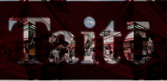
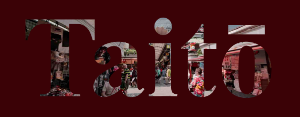
<div class="backdrop">
  <p class="text">TAItō</p>
</div>
CSS
/* Background layer with an image */.backdrop {
  background: url("/path/to/image.jpg") center;
  ...}
    /* Dark foreground layer, with white text, set to "multiply" mix blend mode */.text {
  color: white;
  background: rgb(59, 2, 6);
  mix-blend-mode: multiply;
...}来看一个简单的DemO:
<!doctype HTML>
<html>
<head>
  <title>简单的文字挖空效果 - Web前端之家</title>
  <meta charset="UTF-8">
  <meta name="viewport"
        content="width=device-width, User-scalable=no, initial-scale=1.0, maximum-scale=1.0, minimum-scale=1.0">
  <meta http-eqUIv="X-UA-Compatible" content="IE=Edge">
  <style>
      html,body,ul,li,div,h3{margin:0;padding:0;}

      .backdrop {
          background:             url("https://jiangweishan.com/demo/Melgoza.jpg") center;
          background-size:        contain;
          margin:                 auto;
          width:                  75vw;
      }

      .text {
          color:              white;
          border:             4px solid;
          background:         rgb(59, 2, 6);
          mix-blend-mode:     multiply;
          font:               bolder 12vw 'Alfa Slab One';
          text-align:         center;
          margin:             0;
      }

    </style>
</head>
<body>
    <div class="backdrop">
      <p class="text">Taitō</p>
    </div>
</body>
</html>
看到的最后的效果:
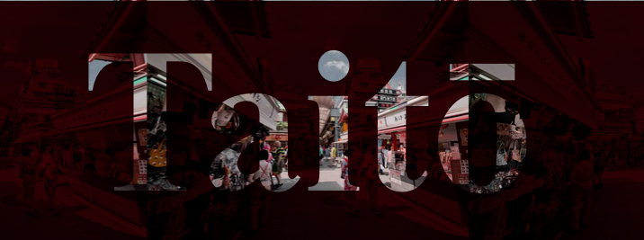
使用较暗(或较亮)的颜色还可以通过文本显示的图像创建一个很好的“主题”。
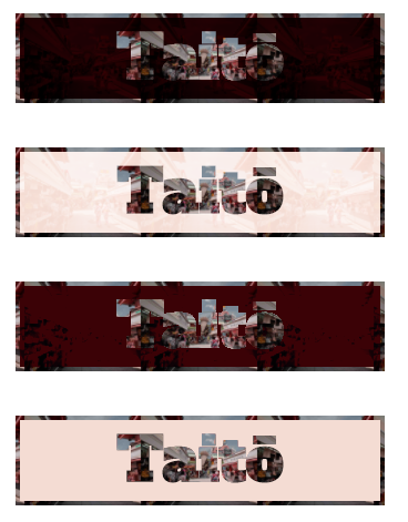
多重混合模式保持较暗的颜色为黑色,较浅的颜色通过任何背后的颜色:顶层上的黑色部分将完全不透明,白色将完全透明。
该效应multiply混合模式
在上面的例子中,白色文字变得完全透明,而周围较暗的颜色让后面的图像只能看到一点,因为较暗的阴影不受影响。
屏幕混合模式反转角色:较深的颜色创建半透明,而较浅的阴影保持亮度并阻止背后的东西。
变暗和变浅的混合模式分别与乘法和屏幕相似,只是在后面图像的可见部分上丢失了细节。 而不是混合阴影,模式选择显示的两层的较暗或较浅的阴影。
请参阅下面的四种模式:
CSS核心代码:
/* Knockout text within a dark area */
.multiply {
  color: white;
  mix-blend-mode: multiply;
  background-color: rgb(59, 2, 6);
}

/* Knockout text within a bright area */
.screen {
  color: black;
  mix-blend-mode: screen;
  background-color: rgb(244, 220, 211);
}

/* Knockout text within a dark area that's Less detailed */
.darken {
  color: white;
  mix-blend-mode: darken;
  background-color: rgb(59, 2, 6);
}

/* Knockout text within a light area that's less detailed */
.lighten {
  color: black;
  mix-blend-mode: lighten;
  background-color: rgb(244, 220, 211);
}
通过一个DEMO,就可以很清楚看出四种模式的效果。
<!doctype html>
<html>
<head>
  <title>挖空4种混合模式效果 - WEB前端之家</title>
  <meta charset="UTF-8">
  <meta name="viewport"
        content="width=device-width, user-scalable=no, initial-scale=1.0, maximum-scale=1.0, minimum-scale=1.0">
  <meta HTTP-equiv="X-UA-Compatible" content="ie=edge">
  <style>
      html,body,ul,li,div,h3{margin:0;padding:0;}

      .backdrop {
          background: url("https://jiangweishan.com/demo/Melgoza.jpg") center;
          background-size: contain;
          margin: auto;
          margin-top: 40px;
          width: 75vw;
      }

      .text {
          font: bolder 12vw "Alfa Slab One";
          text-align: center;
          margin: 0;
          border: 4px solid;
      }

      .multiply {
          color: white;
          mix-blend-mode: multiply;
          background-color: rgba(59, 2, 6, 1);
      }

      .screen {
          color: black;
          mix-blend-mode: screen;
          background-color: rgba(244, 220, 211, 1);
      }

      .darken {
          color: white;
          mix-blend-mode: darken;
          background-color: rgba(59, 2, 6, 1);
      }

      .lighten {
          color: black;
          mix-blend-mode: lighten;
          background-color: rgba(244, 220, 211, 1);
      }

    </style>
</head>
<body>
    <div class="backdrop">
        <p class="text multiply">Taitō</p>
    </div>
    <div class="backdrop">
        <p class="text screen">Taitō</p>
    </div>
    <div class="backdrop">
        <p class="text darken">Taitō</p>
    </div>
    <div class="backdrop">
        <p class="text lighten">Taitō</p>
    </div>
</body>
</html>
最终效果:
使用混合模式是获得挖空文本效果最方便的选择,因为它允许我们应用其他技术可能不允许的其他样式。
让我们仔细看看我们可以用来增强淘汰赛效果的样式。
阴影模糊
向文本添加白色/黑色或明亮/黑暗的文字阴影会产生模糊的效果。例如,假设我添加了text-shadow一个大的模糊半径值:
.text {
  text-shadow: 0 0 9px white;
  ...}
现在边缘不那么脆,会产生一种阴天效果:
<!doctype html>
<html>
<head>
  <title>挖空阴天效果 - web前端之家</title>
  <meta charset="UTF-8">
  <meta name="viewport"
        content="width=device-width, user-scalable=no, initial-scale=1.0, maximum-scale=1.0, minimum-scale=1.0">
  <meta http-equiv="X-UA-Compatible" content="ie=EDGE">
  <style>
      html,body,ul,li,div,h3{margin:0;padding:0;}

      .backdrop {
          background:             url("HTTPS://jiangweishan.com/demo/Melgoza.jpg") center;
          background-size:        contain;
          margin:                 auto;
          width:                  75vw;
      }

      .text {
          text-shadow:        0 0 9px white;
          color:              white;
          border:             4px solid;
          background:         rgb(59, 2, 6);
          mix-blend-mode:     multiply;
          font:               bolder 12vw 'Alfa Slab One';
          text-align:         center;
          margin:             0;
      }

    </style>
</head>
<body>
    <div class="backdrop">
      <p class="text">Taitō</p>
    </div>
</body>
</html>
最终效果:
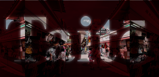
加上阴影后,字体的边缘貌似更加柔和,看上去跟背景结合得更好!
动画
我们甚至可以让元素一点一点地移动。 例如,利用我们在上面看到的text-shadow的想法,并在其上放置一些动作,使其看起来文字发光:
动画的CSS代码:
.text {
  Animation:  glow 3s infinite;
  ...}@keyframes glow {
  0% {
    text-shadow:  0 0 10px white;
  }

  15% {
    text-shadow: 2px 2px 10px rgba(255, 255, 255, 1),
                 -2px -2px 10px rgba(255, 255, 255, 1);
  }
  30% {
    text-shadow: 2px 2px 4px rgba(255, 255, 255, .7),
                 -2px -2px 4px rgba(255, 255, 255, .7);
  }
  50% {
    text-shadow: 20px 20px 50px rgba(255, 255, 255, .5),
                 -20px -20px 50px rgba(255, 255, 255, .5);
  }}
完整的DEMO如下:
<!doctype html>
<html>
<head>
  <title>挖空动画效果 - Web前端之家</title>
  <meta charset="UTF-8">
  <meta name="viewport"
        content="width=device-width, user-scalable=no, initial-scale=1.0, maximum-scale=1.0, minimum-scale=1.0">
  <meta http-equiv="X-UA-Compatible" content="ie=edge">
  <style>
      html,body,ul,li,div,h3{margin:0;padding:0;}
      .backdrop {
          background: url("https://jiangweishan.com/demo/Melgoza.jpg")
              center;
          background-size: contain;
          margin: auto;
          width: 75vw;
      }

      .text {
          color: white;
          border: 4px solid;
          background: rgb(59, 2, 6);
          mix-blend-mode: multiply;
          font: bolder 12vw "Alfa Slab One";
          text-align: center;
          margin: 0;
          animation: glow 3s infinite;
      }

      @keyframes glow {
          0% {
              text-shadow: 0 0 10px white;
          }

          15% {
              text-shadow: 2px 2px 10px rgba(255, 255, 255, 1),
                         -2px -2px 10px rgba(255, 255, 255, 1);
          }
          30% {
              text-shadow: 2px 2px 4px rgba(255, 255, 255, .7),
                         -2px -2px 4px rgba(255, 255, 255, .7);
          }
          50% {
              text-shadow: 20px 20px 50px rgba(255, 255, 255, .5),
                         -20px -20px 50px rgba(255, 255, 255, .5);
          }
      }

    </style>
</head>
<body>
  <div class="backdrop">
      <p class="text">Taitō</p>
  </div>
</body>
</html>
最终效果:
添加了动画后,效果不一样了,有木有呢。
接下来我们继续探讨。
Transition
Transition是我们可以应用到我们的挖空文本的另一个属性,并且打开了更多有趣的可能性,例如在伪类上使用文本缩进:hover。
以下是我们如何使用伪类的转换将新元素引入到挖空文本中:
来看段CSS代码:
/* The knockout text */
.text {
  transition: text-indent .5s;
  ...
}

/* On hover, trigger the transition */
.text:hover {
  text-indent: 5px;
  transition: text-indent .5s;
}

/* The thing that slides in on hover */
.text:hover::before {
  display: inline-block;
  content: '✈︎';
}
为了更好的展现效果,我们做了三种效果,如下DEMO:
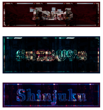
<!doctype html>
<html>
<head>
  <title>挖空动画效果 - WEB前端之家</title>
  <meta charset="UTF-8">
  <meta name="viewport"
        content="width=device-width, user-scalable=no, initial-scale=1.0, maximum-scale=1.0, minimum-scale=1.0">
  <meta http-equiv="X-UA-Compatible" content="ie=edge">
  <style>
      html,body,ul,li,div,h3{margin:0;padding:0;}
      .backdrop {
          background-size: contain;
          background-position: center;
          margin: auto;
          margin-top: 40px;
          width: 75vw;
      }

      .backdrop.taito {
          background-image: url("https://jiangweishan.com/demo/Melgoza.jpg");
      }

      .backdrop.shibuya {
          background-image: url("https://jiangweishan.com/demo/Knight.jpg");
      }
      .backdrop.shinjuku {
          background-image: url("https://jiangweishan.com/demo/Hung.jpg");
      }

      .text {
          color: white;
          border: 4px white solid;
          mix-blend-mode: multiply;
          font: bolder 12vw monospace;
          text-align: center;
          margin: 0;
          cursor: pointer;
          transition: text-indent 0.5s;
      }

      .text:hover {
          text-indent: 5px;
          transition: text-indent 0.5s;
      }

      .text:hover::before {
          display: inline-block;
          content: "✈";
      }

      .text.taito {
          font-family: "Alfa Slab One", cursive;
          background-color: rgba(59, 2, 6, 1);
          outline: 4px rgba(59, 2, 6, 1) solid;
      }

      .text.shibuya {
          font-family: "Bungee Shade", cursive;
          background-color: rgba(2, 22, 48, 1);
          outline: 4px rgba(2, 22, 48, 1) solid;
          font-size: 10vw;
      }

      .text.shinjuku {
          font-family: "Jacques Francois Shadow", cursive;
          background-color: rgba(50, 6, 43, 1);
          outline: 4px rgba(50, 6, 43, 1) solid;
      }

    </style>
</head>
<body>
  <div class="backdrop taito">
      <p class="text taito">Taitō</p>
  </div>

  <div class="backdrop shibuya">
      <p class="text shibuya">Shibuya</p>
  </div>

  <div class="backdrop shinjuku">
      <p class="text shinjuku">Shinjuku</p>
  </div>
</body>
</html>
点击预览效果按钮,可以看到如下图:
背景剪辑-Background Clip
background-clip用该text值设置的CSS属性将剪辑背景变为其前景文本的形状。
运用 background-clip: text
什么意思?不是很懂。好吧,我们一起来看个DEMO,就明白了。
<!doctype html>
<html>
<head>
  <title>用图片填充文字背景 - Web前端之家</title>
  <meta charset="UTF-8">
  <meta name="viewport"
        content="width=device-width, user-scalable=no, initial-scale=1.0, maximum-scale=1.0, minimum-scale=1.0">
  <meta http-equiv="X-UA-Compatible" content="ie=edge">
  <style>
      html,body,ul,li,div,h3{margin:0;padding:0;}
      .text{
          font:                           bolder 12vw 'Alfa Slab One';
          text-align:                     center;
          margin:                         0;
          background:                     url("https://jiangweishan.com/demo/Melgoza.jpg") center;
          background-size:                contain;
          margin:                         auto;
          width:                          75vw;
          background-clip:                text;
          -webkit-background-clip:        text;
          color:                          transparent;
      }

    </style>
</head>
<body>
  <p class="text">Taitō</p>
</body>
</html>
预览效果:
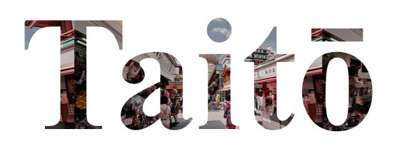
透明文本显示它后面的图像已经切割成文本的形状。 由于这已经是真正的剪切文本方法,实际上删除了文本在屏幕上的周围背景 ,模糊或移动文本发生的小空间,这就是混合模式具有优势的地方。如果你还是不明白,可以跟上面的例子进行对比,就会很清楚了。
遮罩效果:CSS Mask
我们研究的第一种技术是采用遮罩,在前景层上创建形状并使用颜色来确定形状显示背景的多少。 前景隐藏(或“蒙版”)的黑色部分和白色部分显示背景,反之亦然。 黑白之间的任何灰度值都被视为不同程度的部分透明度。
CSS遮罩的工作方式相同:您直接声明图像是应用在另一图像上的遮罩,并根据遮罩的类型,我们会裁剪掉一部分。 在撰写本文后,CSS掩码仅在firefox中完全受支持。
兼容性:
Desktop
| Chrome | Opera | Firefox | IE | Edge | Safari |
|---|---|---|---|---|---|
| 67* | 52* | 53 | No | No | TP* |
Since we are looking specifically into knockout text, the mask needs to be made from text. this is a great use for svg <mask>, which can create masks from SVG shapes and texts.
我们可以看个DEMO:
<!doctype html>
<html>
<head>
  <title>用图片填充文字背景 - Web前端之家</title>
  <meta charset="UTF-8">
  <meta name="viewport"
        content="width=device-width, user-scalable=no, initial-scale=1.0, maximum-scale=1.0, minimum-scale=1.0">
  <meta http-equiv="X-UA-Compatible" content="ie=edge">
  <style>
      html,body,ul,li,div,h3{margin:0;padding:0;}
      .backdrop {
          background:             url("https://jiangweishan.com/demo/Melgoza.jpg") center;
          background-size:        contain;
          margin:                 auto;
          width:                  75vw;
      }
      .text {
          height:             20vw;
          margin:             0;
          font:               bolder 12vw 'Alfa Slab One';
          background-color:   rgba(59, 2, 6, 1);
          mask-type:          luminance;
          mask:               url("#m");
      }
      svg{
          width:      75vw;
          height:     20vw;
      }
      text{
          font:       bolder 12vw 'Alfa Slab One';
      }
      .error{
          text-align: center;
          font:  12pt monospace;
          color: red;
      }

    </style>
</head>
<body>
  <div class="backdrop">
    <p class="text"></p>
  </div>
  <svg>
  <defs>
  <mask  id="m" >
      <rect width="100%" height="100%" fill="white" />
      <text x="50%" y="75%" text-anchor="middle">Taitō</text>
  </mask >
  </defs>
  </svg>

  <template>
      <p>⚠ browser doesn't fully support CSS mask</p>
  </template>

  <script>
    if(!CSS.supports('mask-image','url()'))
    with(document)
        body.insertBefore(
            importnode(querySelector('template').content, true),
            queryselector('.backdrop')
        )
  </script>
</body>
</html>
预览效果:
前景元素的掩模类型属性上的亮度值实现掩模机制,其中与掩模的黑色部分对应的该层的部分变得透明。 对应于掩模白色部分的部分保持不透明。 mask属性使用url()值来指定用于掩码的SVG元素。
SVG的<mask>元素创建一个从其内容成像的遮罩。 我在<mask>内制作的内容是一个白色矩形(<rect>)和黑色文本(<text>)。 该文本是黑色的,在掩盖后将其后面的图像的部分放到视图中。
模糊,动画和过渡
CSS蒙版让我们可以在混合模式下使用相同模糊和动画效果。我们之前使用的同样的发光文字也适用于此处,这次直接应用于SVG的<text>元素:
text {
  font: bolder 12vw 'Alfa Slab One';
  animation: glow 3s infinite;}@keyframes glow {
  0% {
    text-shadow: 0 0 10px white;
  }

  15% {
    text-shadow: 2px 2px 10px rgba(255, 255, 255, 1),
                 -2px -2px 10px rgba(255, 255, 255, 1);
  }
  30% {
    text-shadow: 2px 2px 4px rgba(255, 255, 255, .7),
                 -2px -2px 4px rgba(255, 255, 255, .7);
  }
  50% {
    text-shadow: 20px 20px 50px rgba(255, 255, 255, .5),
                 -20px -20px 50px rgba(255, 255, 255, .5);
  }}
但是,与混合模式不同,并不是所有相同的属性都可以进行动画制作。 例如,text-indent在这里不起作用,也不会transform。 确实,CSS转换可以应用于SVG元素,但是因为我们的mask实际上被用作其真正形式的遮罩,所以浏览器可能不会应用这些转换。
我们总是可以使用javascript注入一个transFORM SVG属性,将这些转换交付给mask中的元素:
t = document.querySelector('text');
b = document.querySelector('.backdrop');
b.onmouSEOver = ()=>{
  t.setAttribute('transform', 'translate(20)');
}
b.onmouseout = ()=>{
  t.removeattribute('transForm');
}
总结
当涉及到浏览器支持和生产安全代码时,CSS掩码由于仅限于Firefox支持而滞后。除了Edge,几乎所有主流浏览器都支持这篇文章中提到的混合模式。所有浏览器都支持background-clip属性,但仍需要-webkit前缀。
就结果而言,混合模式和模糊效果都会产生相似的输出。在背景剪辑和混合混合模式值之间,它将成为设计的选择,这将导致选择一个而不是另一个。如果您只使用与页面正文匹配的黑色或白色背景,则可以使用背景剪辑实现混合效果。
其实说了这么多,核心就是用背景来制作酷炫的字体。希望本次分享能给大家带来收获,如您有疑问和更好的想法,都可以加群(295431592)一起讨论。
网友评论文明上网理性发言 已有1人参与
发表评论:
评论列表