本文实例讲述了JQuery+css3实现淘宝移动网页菜单效果。分享给大家供大家参考。具体如下:
这是一款基于jQuery+CSS3实现的淘宝移动网页菜单,其实这个菜单动画并不复杂,只有缩放和位移。难点是用了扇形结构,而且还要实现扇形的链接区域,这个就费脑筋了,最后采用了传统的图片map来做热区,效果还不错。相信肯定有更好的解决方法。
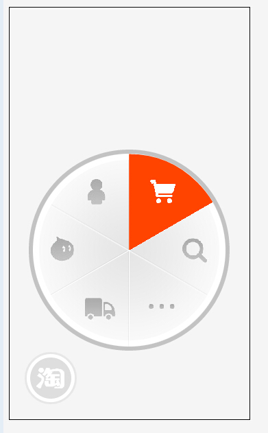
先来看看运行效果截图:
在线演示地址如下:
http://demo.jb51.net/js/2015/jquery-css3-taobao-phone-menu-codes/
具体代码如下:
<!doctype html>
<HTML>
<head>
<meta charset="utf-8">
<title>CSS3实现淘宝移动网页菜单</title>
<script src="jquery-1.6.2.min.JS"></script>
<style type="text/css">
body { background: #f5f5f5; }
ul, li,img { margin: 0; padding: 0; list-style: none; border:0;}
a { outline:none;}
.phone { width:350px; height:600px; border:#000 solid 1px; position:absolute;}
.plate { width: 281px; height: 281px; border-radius:50%; padding:6px; background:rgba(0,0,0,0.2); overflow: hidden; position: absolute; bottom:0; left:0;}
.link { width: 100%; height: 100%; position: absolute; }
.sector { width: 281px; height: 281px; overflow: hidden; background: url(images/bg.png); position: absolute; }
.sector li { position: absolute; width: 50%; height: 50%; overflow: hidden; }
.sector a { position: absolute; width: 100%; height: 100%; border-top-left-radius: 100%; line-height: 999px; -WEBkit-transform: rotate(30deg); -moz-transFORM: rotate(30deg); margin: -25px 0 0 45px; background: #ff4400; display:none; }
.sector li.r2 { -webkit-transform: rotate(60deg); -moz-transForm: rotate(60deg); margin: -26px 0 0 96px; }
.sector li.r3 { -webkit-transform: rotate(120deg); -moz-transform: rotate(120deg); margin: 44px 0 0 166px; }
.sector li.r4 { -webkit-transform: rotate(180deg); -moz-transform: rotate(180deg); margin: 140px 0 0 140px; }
.sector li.r5 { -webkit-transform: rotate(240deg); -moz-transform: rotate(240deg); margin: 166px 0 0 44px; }
.sector li.r6 { -webkit-transform: rotate(300deg); -moz-transform: rotate(300deg); margin: 96px 0 0 -26px; }
.icon { position: absolute; }
.icon li { position: absolute; width: 44px; height: 37px; background: #ccc; overflow: hidden; line-height: 999px; background: url(images/icon.png); display: none; }
.icon li.r1 { margin: 37px 0 0 71px; background-position: 0 -37px; }
.icon li.r2 { margin: 37px 0 0 168px; background-position: -220px -37px;}
.icon li.r3 { margin: 122px 0 0 214px; background-position: -176px -37px;}
.icon li.r4 { margin: 204px 0 0 165px; background-position: -132px -37px; }
.icon li.r5 { margin: 208px 0 0 76px; background-position: -88px -37px; }
.icon li.r6 { margin: 120px 0 0 21px; background-position: -44px -37px;}
.home { width:138px; height:138px; overflow:hidden; line-height:999px; position:absolute; border-radius:50%; left:50%; top:50%; margin:-69px 0 0 -69px;}
.home.over a { display:block; background:#ff4400; width:125px; height:125px; border-radius:50%; margin:7px;}
.home.over a span { display:block; width:53px; height:46px; position:relative; margin:auto; top:40px;}
.menu { position:absolute; bottom:25px; left:25px;}
.menu a { display:block; width:60px; height:60px; border-radius:50%; background:#ff4400; border:#fff solid 5px; box-shadow: 0 0 0 3px rgba(200,200,200,0.3);}
.menu a span { background:url(images/icon.png) no-repeat -264px -46px; display:block; width:41px; height:31px; overflow:hidden; line-height:999px; margin:14px 0 0 9px;}
/*菜单动画*/
.plate {
 -webkit-transition:all 0.3s;
 transition:all 0.3s;
 -webkit-transform:translate(-100px,100px) scale(0,0) rotate(0);
 transform:translate(-100px,100px) scale(0,0) rotate(0);
}
.plate.open {
 -webkit-transform:translate(28px,-100px) scale(1,1) rotate(360deg);
 transform:translate(28px,-100px) scale(1,1) rotate(360deg);
}
.menu a {
 -webkit-transition:all 0.3s;
 transition:all 0.3s;
}
.menu a.open { background:rgba(200,200,200,0.5);}
</style>
</head>
<body>
<p>若动画不流畅请刷新一下页面</p>
<div class="phone">
 <div class="plate">
 <ul class="sector">
 <li class="r1"><a href="#">我的淘宝</a></li>
 <li class="r2"><a href="#">购物车</a></li>
 <li class="r3"><a href="#">搜索</a></li>
 <li class="r4"><a href="#">更多</a></li>
 <li class="r5"><a href="#">物流</a></li>
 <li class="r6"><a href="#">旺旺</a></li>
 </ul>
 <ul class="icon">
 <li class="r1">我的淘宝</li>
 <li class="r2">购物车</li>
 <li class="r3">搜索</li>
 <li class="r4">更多</li>
 <li class="r5">物流</li>
 <li class="r6">旺旺</li>
 </ul>
 <div class="home"><a href="#"><span>主页</span></a></div>
 <div class="link"><img src="images/link.png" width="100%" height="100%" uSEMap="#Map">
 <map name="Map" id="map">
  <area shape="poly" coords="140,67,139,1,72,21,25,68,85,107" href="#a">
  <area shape="poly" coords="196,105,256,74,213,23,141,5,142,73" href="#b">
  <area shape="poly" coords="196,106,257,75,277,132,260,208,198,174" href="#c">
  <area shape="poly" coords="195,173,258,211,214,259,144,279,141,205" href="#d">
  <area shape="poly" coords="141,203,136,279,68,256,21,208,86,174" href="#e">
  <area shape="poly" coords="84,169,18,206,2,131,22,72,83,108" href="#f">
  <area shape="circle" coords="141,140,63" href="#home">
 </map>
 </div>
 </div>
 <div class="menu">
 <a href="#taobao"><span>淘宝</span></a>
 </div>
</div>
<script>
$("#map area[shape='poly']").hover(function(){
 i = $(this).index();
 $(".sector a").eq(i).show();
 $(".icon li").eq(i).show();
},function(){
 $(".sector a").eq(i).hide();
 $(".icon li").eq(i).hide();
});
$("#map area[shape='circle']").hover(function(){
 $(".home").addClass("over");
},function(){
 $(".home").removeClass("over");
});
$(".menu a").click(function(){
 if($(this).attr("class") == "open"){
  $(this).removeClass("open");
  $(this).addClass("close");
  $(".plate").removeClass("open");
  $(".plate").addClass("close");
 }else{
  $(this).removeClass("close");
  $(this).addClass("open");
  $(".plate").removeClass("close");
  $(".plate").addClass("open");
 }
});
</script>
</body>
</html>


网友评论文明上网理性发言 已有0人参与
发表评论: