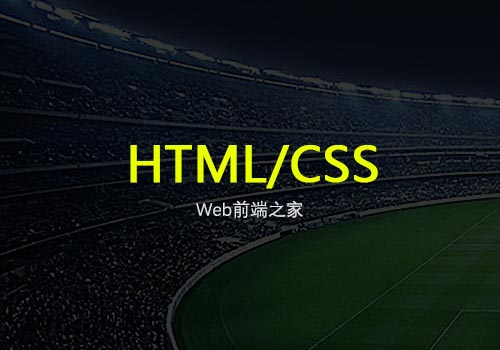
按钮点击CSS3特效:鼠标点击按钮酷炫发散效果。这个效果很实用的,大家可以看下DemO。效果图:

DEMO代码走一波:
<!DOCtype html>
<HTML lang="en">
<head>
    <meta charset="UTF-8">
    <meta name="viewport" content="width=device-width, initial-scale=1.0">
    <title>Web前端之家https://www.jiangweishan.com</title>
    <style>
        .BTn{
            display: block;
            width: 300px;
            height: 100px;
            margin: 50px;
            outline: 0;
            overflow: hidden;
            position: relative;
            transition: .3s;
            cursor: pointer;
            user-select: none;
            text-align: center;
            line-height: 100px;
            font-size: 50px;
            background: tomato;
            color: #fff;
            border-radius: 10px;
        }
        .btn>span{
            position: absolute;
            left: 0;
            top: 0;
            width: 100%;
            height: 100%;}
        .btn>span:after{
            content: '';
            position: absolute;
            background: transparent;
            border-radius:50%;
            width: 100%;
            padding-top: 100%;
            margin-left: -50%;
            margin-top: -50%;
            left: var(--x,-100%);
            top: var(--y,-100%);
        }
        .btn:active{
            background: orangered;
        }
        .btn>input[type=checkbox]{
            display: none
        }
        .btn>input[type=Checkbox]+span:after{
            Animation: ripple-in 1s;
        }
        .btn>input[type=checkbox]:checked+span:after{
            animation: ripple-out 1s;
        }
        @keyframes ripple-in{
            from {
                transform: scale(0);
                background: rgba(0,0,0,.25)
            }
            to {
                transFORM: scale(1.5);
                background: transparent
            }
        }
        @keyframes ripple-out{
            from {
                transform: scale(0);
                background: rgba(0,0,0,.25)
            }
            to {
                transForm: scale(1.5);
                background: transparent
            }
        }
    </style>
</head>
<body>
    <label class="btn" tabindex="1">
        <input type="checkbox"><span onclick="ripple(this,event)">WEB前端之家</span>
    </label>
</body>

<script>
    function ripple(DOM,ev){
        console.log(ev)
        var x = ev.offsetX;
        var y = ev.offsetY;
        dom.style.setproperty('--x',x+'px');
        dom.style.setPRoperty('--y',y+'px');
}
</script>
</html>


网友评论文明上网理性发言 已有0人参与
发表评论: