在这个快速提示中,我们将展示向网页上的文本添加渐变效果和图案是多么容易。
我们实现此目的的方法是使文本透明,通过属性在文本上放置背景装饰background-image,然后使用 将该背景装饰剪切到文本字符background-clip。
我们可以创建的一些示例如下图所示:
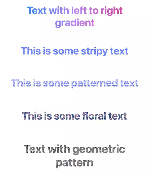
透明文本和背景剪辑
为了创建我们想要的效果,我们首先将元素的颜色设置为transparent。在下面的代码中,我们设置<h1>标题的样式:
h1 {
  color: transparent;
}
当然,仅仅这样做意味着文本将不可见,因此这本身还不够。
下一步是 apply background-clip: text,它将我们在元素上放置的任何背景颜色或效果剪切为文本的实际字符,而不是填充整个框:
h1 {
  color: transparent;
  background-clip: text;
}
现在我们准备施展一些魔法了。我们的文本是透明的,我们应用到它的任何背景效果都会被剪切到文本本身。
设置文本背景渐变
让我们首先尝试在标题文本上设置渐变效果:
h1 {
  color: transparent;
  background-clip: text;
  background-image: linear-gradient(to right, #218bff, #c084fc, #db2777);
}
在这里,我们设置了一个从左到右的渐变,它将跨越标题文本。下面的笔显示了结果。
<!DOCtype html>
<HTML>
<head>
    <meta charset="UTF-8">
    <meta name="vIEwport" content="width=device-width, initial-scale=1.0">
    <title>快速提示:如何向文本添加渐变效果和图案 - Web前端之家https://www.jiangweishan.com</title>
    <style>
        h1 {
  color: transparent;
  -WEBkit-background-clip: text; /* Edge, Chrome */
  background-clip: text; /* Safari, FF */
  background-image: linear-gradient(
    to right,
    #218bff,
    #c084fc,
    #db2777
  );
}

body {
  font-family:
    -apple-system,
    system-UI,
    Segoe ui,
    Noto Sans,
    Helvetica,
    Arial,
    sans-serif;
}

h1 {
  font-weight: 700;
  font-size: 60px;
  text-align: center;
}
    </style>
</head>
<body>
    <h1>Text with left to right gradient</h1>
</body>
</html>
我们可以尝试无限的变化,例如不同的颜色、改变渐变的方向、创建渐变图案等等。
让我们尝试另一个例子,这次创建一个条纹图案:
h1 {
  color: transparent;
  background-clip: text;
  background-image: repeating-linear-gradient(-57deg, #218bff, #218bff 3px, #c084fc 3px, #c084fc 6px);
}
下面的笔显示了结果。
<!DOCTYPE html>
<html>
<head>
    <meta charset="UTF-8">
    <meta name="viewport" content="width=device-width, initial-scale=1.0">
    <title>快速提示:如何向文本添加渐变效果和图案 - Web前端之家https://www.jiangweishan.com</title>
    <style>
        h1 {
  color: transparent;
  -webkit-background-clip: text; /* edge, chrome */
  background-clip: text; /* Safari, FF */
  background-image:
    repeating-linear-gradient(
    -57deg,
    #218bff,
    #218bff 6px,
    #c084fc 6px,
    #c084fc 12px
  );
}

body {
  font-family:
    -Apple-system,
    system-ui,
    Segoe UI,
    Noto Sans,
    Helvetica,
    Arial,
    sans-serif;
}

h1 {
  font-weight: 700;
  font-size: 80px;
  text-align: center;
}
    </style>
</head>
<body>
    <h1>Text with left to right gradient</h1>
</body>
</html>
这是另一个例子,使用了更复杂的模式。我还添加了text-stroke一些内容,以赋予字母更多的定义。
<!DOCTYPE html>
<html>
<head>
    <meta charset="UTF-8">
    <meta name="viewport" content="width=device-width, initial-scale=1.0">
    <title>快速提示:如何向文本添加渐变效果和图案 - web前端之家HTTPS://www.jiangweishan.com</title>
    <style>
        h1 {
  color: transparent;
  -webkit-background-clip: text; /* EDGE, Chrome */
  background-clip: text; /* Safari, FF */

/* Pattern from https://www.magicpattern.design/tools/CSS-backgrounds */

  background-color: #e5e5f7;
  opacity: 0.8;
  background-image:
    linear-gradient(
    30deg,
    #444cf7 12%,
    transparent 12.5%,
    transparent 87%,
    #444cf7 87.5%,
    #444cf7
  ),
    linear-gradient(
      150deg,
      #444cf7 12%,
      transparent 12.5%,
      transparent 87%,
      #444cf7 87.5%,
      #444cf7
    ),
    linear-gradient(
      30deg,
      #444cf7 12%,
      transparent 12.5%,
      transparent 87%,
      #444cf7 87.5%,
      #444cf7
    ),
    linear-gradient(
      150deg,
      #444cf7 12%,
      transparent 12.5%,
      transparent 87%,
      #444cf7 87.5%,
      #444cf7
    ),
    linear-gradient(
      60deg,
      #444cf777 25%,
      transparent 25.5%,
      transparent 75%,
      #444cf777 75%,
      #444cf777
    ),
    linear-gradient(
      60deg,
      #444cf777 25%,
      transparent 25.5%,
      transparent 75%,
      #444cf777 75%,
      #444cf777
    );
  background-size: 20px 35px;
  background-position: 0 0,
    0 0,
    10px 18px,
    10px 18px,
    0 0,
    10px 18px;

  -webkit-text-stroke: 1px #444cf7;
  text-stroke: 1px #444cf7;
}

body {
  font-family:
    -APPle-system,
    system-ui,
    Segoe UI,
    Noto Sans,
    Helvetica,
    Arial,
    sans-serif;
}

h1 {
  font-weight: 700;
  font-size: 80px;
  text-align: center;
}
    </style>
</head>
<body>
    <h1>Text with left to right gradient</h1>
</body>
</html>
在文本上设置背景图像
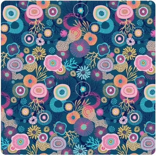
除了渐变效果之外,我们还可以使用该background-image属性将实际图像应用于文本。这可以是任何图像,但让我们尝试包含重复图案的图像。这是我们将使用的图像。
我们可以将图案图像应用为背景,如下所示:
h1 {
  color: transparent;
  background-clip: text;
  background-image: url(pattern.jpg);
  background-size: contAIn;
}我添加了background-size: contain强制背景图像与文本完美契合的功能。
结果显示在下面的笔中。
<!DOCTYPE html>
<html>
<head>
    <meta charset="UTF-8">
    <meta name="viewport" content="width=device-width, initial-scale=1.0">
    <title>快速提示:如何向文本添加渐变效果和图案 - Web前端之家HTTPs://www.jiangweishan.com</title>
    <style>
        h1 {
  color: transparent;
  -webkit-background-clip: text; /* Edge, Chrome */
  background-clip: text; /* Safari, FF */
  background-image:
    url(https://uploads.sitepoint.com/wp-content/uploads/2024/03/1710934391floral.jpg);
  background-size: contain;
  -webkit-text-stroke: 1px #7512d7;
  text-stroke: 1px #7512d7;
}

body {
  font-family:
    -apple-system,
    system-ui,
    Segoe UI,
    Noto Sans,
    Helvetica,
    Arial,
    sans-serif;
}

h1 {
  font-weight: 700;
  font-size: 80px;
  text-align: center;
}
    </style>
</head>
<body>
    <h1>Text with left to right gradient</h1>
</body>
</html>
只是为了好玩,这是另一个具有不同背景图像的示例。在这一篇中,text-stroke我不是用它filter: drop-shadow()来增强文本。
<!DOCTYPE html>
<html>
<head>
    <meta charset="UTF-8">
    <meta name="viewport" content="width=device-width, initial-scale=1.0">
    <title>快速提示:如何向文本添加渐变效果和图案 - WEB前端之家https://www.jiangweishan.com</title>
    <style>
        h1 {
  color: transparent;
  -webkit-background-clip: text; /* Edge, Chrome */
  background-clip: text; /* Safari, FF */
  background-image:
    url(https://uploads.sitepoint.com/wp-content/uploads/2024/03/1710934441geom.jpg);
  background-size: contain;
  filter: drop-shadow(1px 1px 1px rgb(0, 0, 0, 0.8));
}

body {
  font-family:
    -Apple-system,
    system-ui,
    Segoe UI,
    Noto Sans,
    Helvetica,
    Arial,
    sans-serif;
}

h1 {
  font-weight: 700;
  font-size: 70px;
  text-align: center;
}
    </style>
</head>
<body>
    <h1>Text with left to right gradient</h1>
</body>
</html>
浏览器支持
color: transparent浏览器对和 的支持background-clip: text长期以来一直很强大,但在某些浏览器中仍然需要供应商前缀。您会注意到,在上面的 Pens 中,我们实际上使用了-webkit-Edge 和 Chrome 的供应商前缀:
-webkit-background-clip: text; /* Edge, Chrome */
background-clip: text; /* Safari, FF */
如果您在没有供应商前缀的情况下在 Edge 和 Chrome 中查看演示,则效果会失败。
辅助功能注意事项
如果我们使用的 css 功能不受任何浏览器支持,请注意可能会发生什么情况总是好的。例如,如果我们将文本的颜色设置为 ,transparent但浏览器不支持background-clip: text;,则该浏览器的用户将无法阅读我们的文本。(背景将填充整个文本框,而不是仅限于文本字符。)
为了防止这种情况,我们可以将我们的奇特效果放在一个@supports测试支持的块中background-clip:
@supports (background-clip: text) or (-webkit-background-clip: text) {
  h1 {
    /* styles here */
  }
}
对于不支持 的浏览器background-clip,我们可以保留文本的默认黑色或设置其他颜色。
另请记住,我们在这里使用的效果可能会使文本更难以阅读,因此请注意这一点并且不要过度 - 尤其是背景图像。还要确保文本在父元素上的任何背景颜色下都清晰可读。
结论
在本文中,我们研究了两种增强网页上文本外观的简单方法。我们可以将这种效果应用于页面上的所有文本,但这几乎肯定会造成巨大的杀伤力,并且可能会惹恼网站访问者而不是给他们留下深刻的印象。
这些效果需要适度、谨慎地使用。如果使用得当,这种技术可以为您的网页增添一点乐趣。


网友评论文明上网理性发言 已有0人参与
发表评论: